Let’s suppose that you want to create a skewed div from one corner, not from both or all corners. If you are familiar with the ::before and ::after pseudo-elements in CSS, you might think of using them as your first choice. If you know about the transform: skew() property, you might think of that as well. Also, you might consider using a PNG image with a skew and positioning it using CSS as a background on the desired corner.
The first choice can be quite a headache if you want to use it and adjust it on all screens to make it responsive. It is very time-consuming and does not support other properties like box-shadow, etc..
The second choice is nice when you want to skew the entire div or along the Y or X axis. However, for a single side, like the top left corner, it becomes challenging and requires significant time and effort.
The PNG solution is problematic for responsive design.
I tried all of these methods before I used the SVG solution.
The Solution:
Here is the implementation and why it is the better approach.
HTML:
<div class="container">
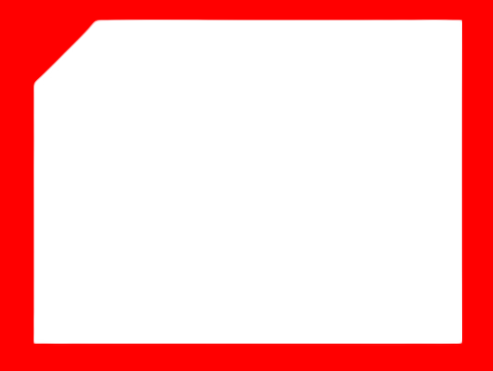
<svg class="shadow-svg" xmlns="http://www.w3.org/2000/svg" viewBox="0 0 388 292.200" preserveAspectRatio="xMidYMid slice">
<path id="Background-card" d="M56.200,0H388V292.887H0V57.754Z" fill="#fff"/>
</svg>
</div>
SCSS:
  .container {
    position: relative;

    svg {
      position: absolute;
      top: 0;
      left: 0;
      width: 100%;
      height: 100%;
      z-index: -1;
    }

    svg.shadow-svg {
      -webkit-filter: drop-shadow(7px 8px 24px rgba(0, 0, 0, 0.08));
      filter: drop-shadow(7px 8px 24px rgba(0, 0, 0, 0.08));
    }
  }
}
Why this solution?:
- You have the flexibility of the SVG element.
- You can apply any normal CSS properties to the SVG.
- Easy to change within the HTML.
- Easy to adjust the SVG element.
- Responsiveness follows the SVG element directly.
- Easy to style.
- Clean implementation.
Hope this helps 🙂